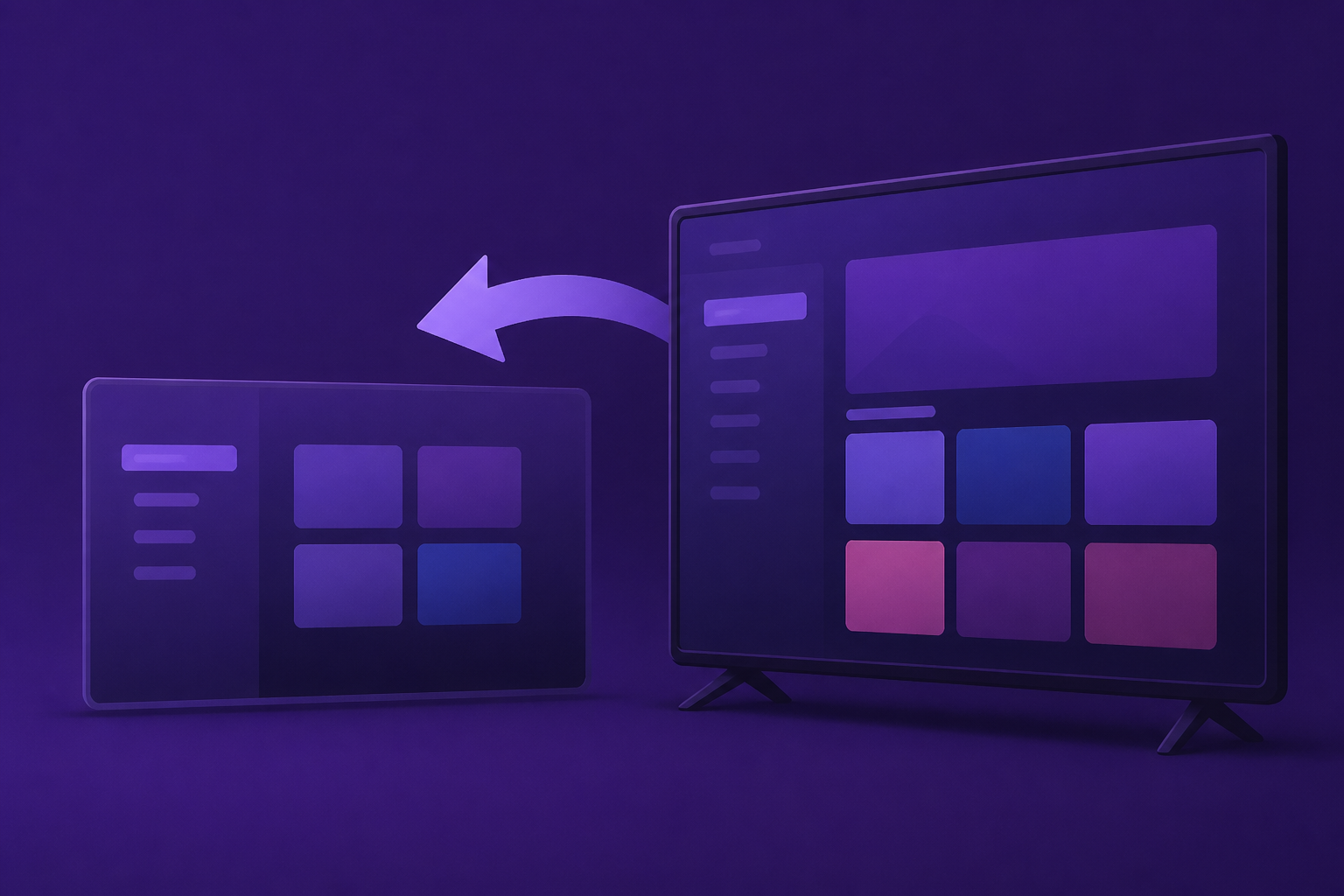
AI Generated Image
How to Go Back to The Old Roku Home Screen
| Cord Cutters News • • technology
Key Points:
- Roku launched its biggest home screen redesign in over a decade, shifting from an app-focused grid to a content-oriented interface that highlights personalized recommendations and quicker access to frequently used features.
- The update introduces an expanded “Top Picks for You” section with AI-driven content suggestions, a Quick Access panel for frequently used apps, and additional rows for mood- or genre-based content, aiming to reduce search time and enhance viewing.
- Users can customize the experience by disabling Recommended rows and Quick Access, and selecting a Large tile size in Settings to restore a simpler, app-centric grid similar to previous Roku interfaces.
- Although the core navigation remains familiar, the update features smaller app tiles by default and a denser layout prioritizing discovery content, with some structural changes like a collapsible left-side menu that cannot be fully reverted.
- The redesign balances automated content organization with user control, allowing viewers to tailor their home screen for either a personalized, AI-driven experience or a more traditional app grid presentation.


