AI Generated Image
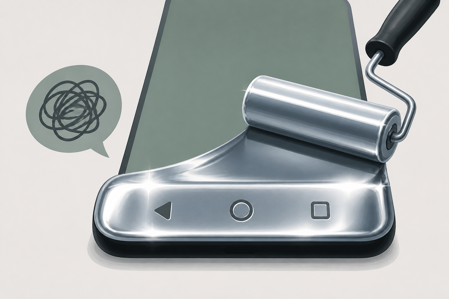
Chrome’s Android navigation bar redesign has too much chrome
9to5Google • • technology
Key Points:
- Chrome for Android has maintained a consistent main interface since 2012, focusing on minimalism with just an address bar and essential buttons, reflecting its original design philosophy of speed and simplicity.
- The upcoming redesign introduces a secondary toolbar at the bottom with buttons for homepage, Gemini, new tab, and tab switcher, plus a dedicated back button next to the Omnibox, adding more functionality but increasing interface thickness.
- Previous attempts at similar redesigns were scrapped due to user disorientation, and the current stacked toolbar design has been criticized for covering too much screen space, especially when viewing Tab Groups.
- While some additions like the Gemini shortcut and a dedicated new tab button are welcomed, the overall bulky bottom interface is seen as impractical, leading some users to revert to the top address bar layout.
- The redesign is gradually rolling out to stable users, but its final form is uncertain, with hopes that Google will either refine the interface or retain the original minimalist option.


