AI Image
Google rolling out gradient icon redesigns for Messages, Phone
9to5Google • • technology
Key Points:
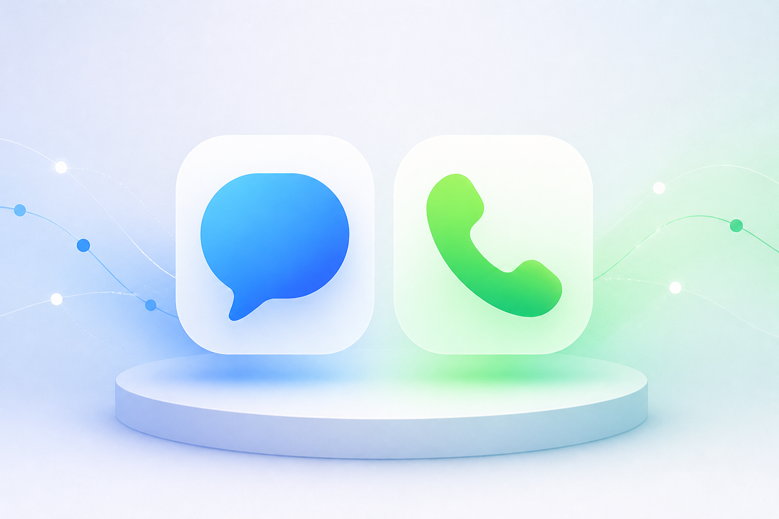
- Google is updating the icons for its Contacts, Messages, and Phone apps to feature sharper, clearer designs with subtle gradients and improved edges.
- The redesign maintains the general shapes of the icons but introduces updated curvature and coloring to align with other Google apps.
- The icon changes are rolling out gradually via the Play Store and are already available in the latest Google Messages beta.
- Google confirms that these updates do not affect app functionality, only the visual appearance on home screens and web versions.


