AI Generated Image
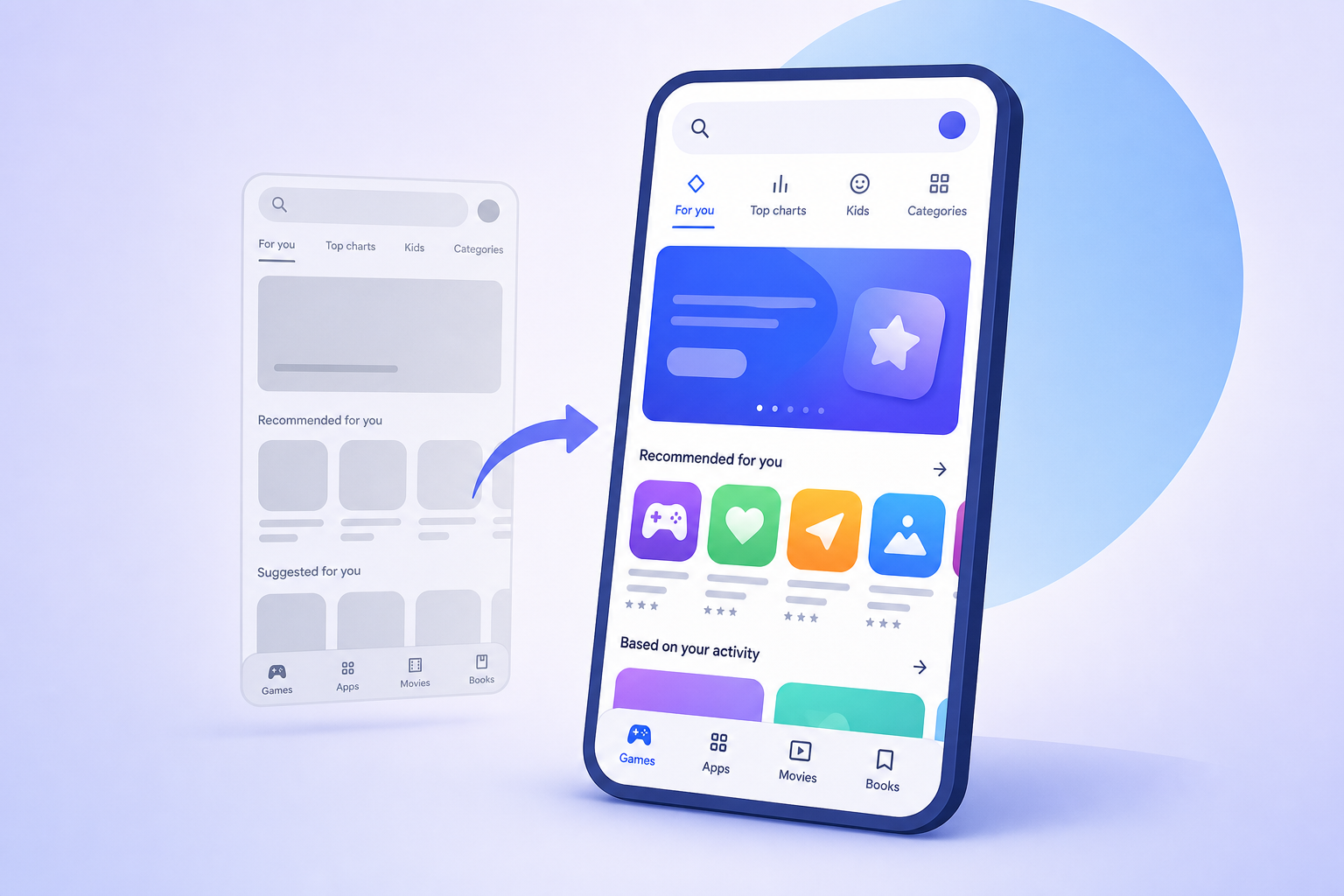
Google Play Store will look a little different the next time you open it
Android Authority • • technology
Key Points:
- Google is rolling out a UI redesign for the Play Store, specifically affecting the Games and Apps tabs, while the Books tab retains the old interface.
- The new design features pill-shaped tabs, removal of the "For you" tab in favor of making it the default home page, and separate pages for "Top charts" and "Categories" requiring a back arrow to return.
- Google Play Points has a refreshed look, with the removal of the blue pill-shaped container previously displaying points, alongside updated badge notification styles.
- These changes are part of a wider update that appears to be rolling out broadly, enhancing navigation and visual presentation within the Play Store.
- APK teardowns suggest potential upcoming features, but these may not necessarily appear in future public releases.


